Annual Report Cover for Bombardier
photos/ar_cover.jpgThe cover for Bombardier Annual Report has a diecut of a gear shape symbolizing the nature of their business and supporting the title Turning Obstacles Into Opportunity.

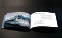
Annual Report Interior Spread
photos/ar_spread1.jpgThe horizontal layout leads readers' eyes laterally to emphasize a sense of movement of a bullet train. Curvy lines over the train amplifies aerodynamic lines of their high speed trains.
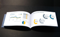
Annual Report Interior Spread
photos/ar_spread2.jpgContrasting yet soft colour schemes work well with white background to portray a subdued and yet sophisticated mood to satisfy the target audience which are stock holders and employees of the company.
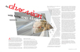
Magazine Layout
photos/magazine_layout_w.jpgThe layout of the magazine provokes a mood of uneasiness and collision based on the article about the Japanese obsession with being on time.
Flyer Layout
photos/flyer_panel_spring2014_4_FR.jpgThe layout of a flyer for the Panel. The curved silhouette of the text layout grabs readers' attention.

Logo for Counselling Services
photos/counselling_logo.jpgA logo for Kate Partridge counselling services. The shape and colour of the logo represents a positive transition of a person, achieved through Kate's counselling.
The Naturalist Logo
photos/hummingbird_w.jpgThe logo was made for a natural product company to be used for their stationery and shopping bags. The humming bird image was handmade using scratchboard.

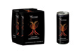
Volcano Energy Drink
photos/energy_drink_w.jpgA package design for an energy drink Volcano. Energetic colours and an interesting magma/volcano imagery grab a potential buyer's attention.
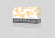
Almond Olive Soap Packaging
photos/soap_almond_w.jpgA design with an almond motif. Almost edible orange colour makes these transparent looking almonds desirable for consumers.
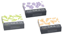
Olive Soap Packaging series
photos/soaps.jpgThree different variations of olive soap series including olive, lavendar, and almond scent.
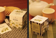
Tea Box Design
photos/teabox_photos_w.jpgIllustration of jasmin flowers, hand drawn with markers, was used on the jasmin tea box. The logo was also created and used on the box as well as the tea bag.
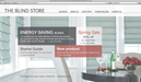
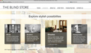
Website for The Blind Store
photos/website_blinds_home.jpgHome page of The Blind Store website. Soft colour palette and magazine-like look of the home page attracts target audience, mostly female clients.
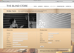
Product Page for The Blind Store Website
photos/website_blinds_products.jpgThe contrast between the greyscale and colours helps a client see which category was selected.
Order Page for The Blind Store Website
photos/website_blinds_order.jpgThe order form is presented in a stylish manner and is easy to use. A client is more likely to stay and complete the forms.
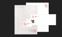
Stationery
photos/stationery_w.jpgA stationery design for my own use. An iconic wordmark using my Korean name in a stamp shape was applied to the business card, letterhead and envelope. The letterhead incorporates an asian rice paper theme.
Font Botanical
photos/botanical_font_w.jpgThis font was inspired by the curvy shape of a leaf. The font works well as a display typeface or even for body text.

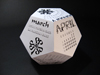
3D Typography Calendar
photos/calendar_w.jpgIt is a typographic calendar dedicating one font for each month. Only type was used in the design.
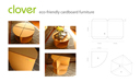
Cardboard Furniture
photos/cardboard_w.jpgA special eco-conscious project. This coffee table/side table/corner shelf was made with cardboard and glue only.
Wild Ponies
photos/ponies_w.jpgThis photo of the wild ponies was taken while I was visiting my friends in California. There is something magical about these wild ponies.
